A Minimum Lovable Product Wins Loyalty
In a world with options, why would I keep coming back to what you offer?
It’s a good product?
But so is theirs. And theirs. And theirs. And theirs.

If you want my loyalty, give me something to love.
Give me a Minimum Lovable Product.
Minimal Difference, Maximised Experience
In this article, I’d like to share Upstack Studio’s thoughts on the concept of a Minimum Lovable Product, or MLP, when applied to software and app development.
This includes looking at how it compares to its ‘little brother’, the Minimum Viable Product, or MVP.
If I’ve done a good job explaining, you’ll see the devil’s truly in the details.
Done right, it’s something really small that separates the two,
However, this slight distinction can have a tremendous effect on how users see a product.
Is it just another solution, or is it the solution?
The Minimum Lovable Product Misunderstanding
Browse online and you’ll find multiple sources comparing basic and fancy coffee to explain what a minimum lovable product is.
The argument: black coffee is a viable option, but fancier coffee is a beloved option.
I respectfully disagree.
To be honest, Upstackers love black coffee, and we’re far from the only ones.

Same with software. Many will take basic (but functional) over fancy any day.
Ultimately, it doesn’t matter. A Minimum Lovable Product has nothing to do with being fancy.
These explanations can get too ahead of themselves and inadvertently over-generalize.
We think that truly understanding the MLP requires going back a step and looking at its earlier stage: the Minimum Viable Product (MVP).
After all, an MLP is an extension of an MVP, so we think it makes sense to first understand the latter.
From there, we hope to convince you that it’s not just about adding milk and sugar to a cup of coffee.
Seriously, what’s not to love about a cup of strong, black Americano?
What’s a Minimum Viable Product?
Let’s give this some context.
Whenever a client has an idea they want to turn into an app, they come for a Product Roadmapping Workshop with us.
By the end, we have clarity on what they ultimately want to offer.
It will take at least several months and many tens of thousands of dollars to complete.
Now, we know that only releasing the product once we reach that point is a bad idea for several reasons.
- You can never be 100% sure of what you need
- We can start testing the viability of the solution way before we get to that point
So we look at everything they want, and we screen it through these questions:
- Can we hold this feature off for a week or more?
- If I remove this, does the product still solve the main customer problem?
- If I remove this feature, does the product still function?
- Did I add this because it’s sexy and shiny?
- Am I on the fence about this feature?
Whatever feature passes those questions gets added to a to-do list.
Once we execute this list, our client has a Minimum Viable Product.
It’s a far cry from the vision in their head, but it’s not meant to look or feel great.
It’s meant to solve the customer’s problem.
Our clients now have a functional prototype they can test on users.
Test, collect feedback, make changes, then test again.
How’s a Minimum Lovable Product Different?
Like a Minimum Viable Product, a Minimum Lovable Product must work.
Unlike a Minimum Viable Product, a Minimum Lovable Product must elicit a positive emotional response from the user.
- Can we hold this feature off for a week or more?
- If I remove this, does the product still solve the main customer problem?
- If I remove this feature, does the product still function?
- Did I add this because it’s sexy and shiny?
- Am I on the fence about this feature?
- Will this feature make customers excited to use the product?
We don’t have to give them the moon, but we don’t want them to just say ‘Yes, this works, so what’s for lunch?’
We want them to say ‘When are you guys launching? I want to be your first paying customer’.
It’s not an exact science, because we’re dealing with emotions here.
But it can be observed, and if we’re methodical about it, we can identify what gets us there.
The Living, Breathing Minimum Lovable Product
I think a better example is to examine human relationships.
The power of an emotional connection is a lot clearer when it’s with people instead of objects.
I assure you, it’s the same thing.
I look at myself as an employer and owner of an app agency.
What’s the minimum viable product I need to provide to my team members?
A salary.
If I stopped paying them, they’d stop working for me.
So that’s the minimum I need to offer.
But it’s also what every other employer offers.
So how can I get them to choose me?
I need to offer an experience that they will love.
Not just once, but every day.
People being people, there will be differences in what they want,
But there will be similarities.
I need to find these similarities and consider my position.
If I can afford to provide it without hurting my business, I provide it.
So I just do this one thing, and I’m able to provide a lovable experience to all of my staff.
That’s the Minimum Lovable Product I offer.
Of course, I can’t and don’t want to deviously calculate these sorts of things, but as a business owner, I’d be blind not to notice the return on investment I get.
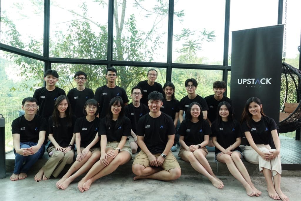
Because I go the extra mile, so does my team.
- We communicate well
- We’re focused
- We pull late nights when they have to
- Some have been with me since the start of Upstack Studio and are invaluable
- And whatever nuclear bomb explodes behind the scenes, clients never know
What kind of nuclear bombs, you wonder?
Keep wondering!
If I could sum it up in one word, I get loyalty.
Applying MLP Concept to Our Client’s App
The MVP stage is a given. It HAS to be a viable product, just like I HAVE to provide a salary.
Beyond bare-bones functionality, what can create excitement in your target user from the first use?
It varies from app to app, but it can only come from two things: features, or UI/UX.
What feature, or what level of UI/UX design, that’s the question.
IF we can find that answer, IF we can get people to have that emotional reaction.
- We have a better chance at a higher price point.
- We have a better chance at organic growth
- We have a better chance people will allow us access to their data
- And during tough times, people stay loyal because emotions are recession-proof.
We need empathy.
And a good designer.
Really step into customers’ shoes and from there, find a compromise between what they’ll enjoy, and our own urgency to go to market as quickly as possible.
That’s why I really don’t like these coffee examples!
They seem to forget that we always start with the customer.
They also completely ignore our needs as product owner.
Should You Start Testing With MVP or MLP?
I hope there’s no disagreement here that a Minimum Lovable Product is always superior to a minimum viable product, especially compared side by side.
It’s literally like looking at a Pokemon evolving.
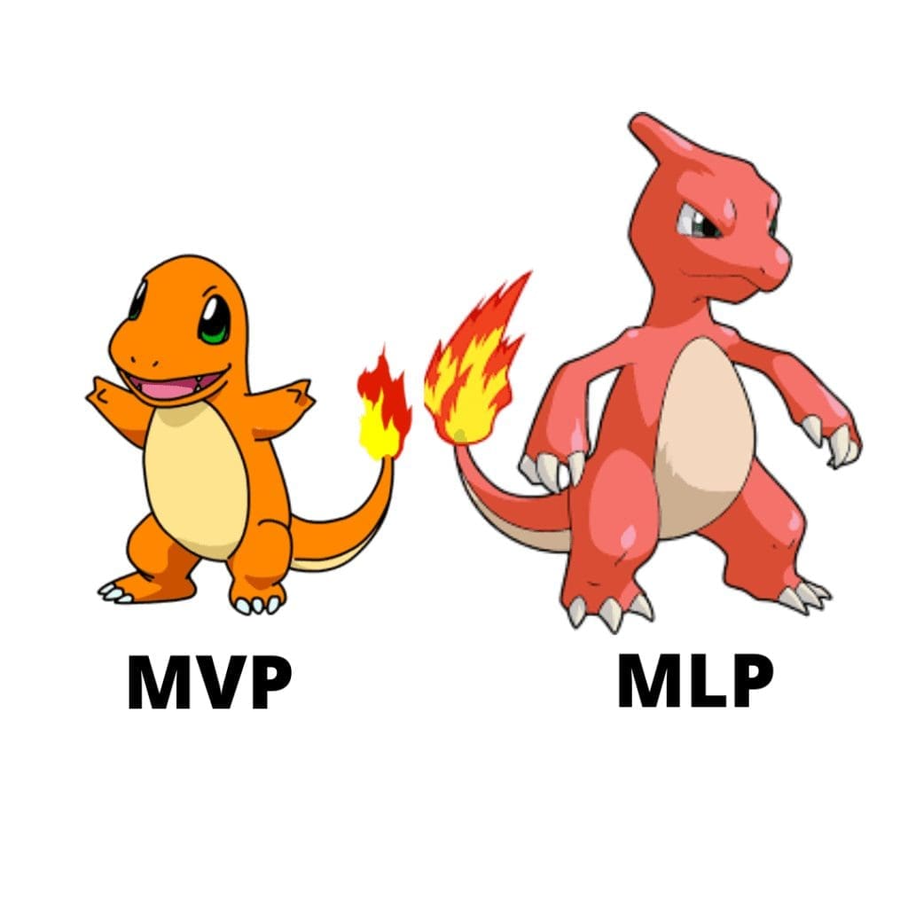
So does that mean MLP is always the better choice?
Nope! It depends on where you are in your journey as a founder.
Do you already have a validated idea?
If you don’t, you better have a really good reason to push for MLP immediately.
An MLP either has more features, more intricate UI/UX, or both.
That means it will take more time and money to build compared to an MVP. Why take on extra risk to build something people will love, when you don’t even know if people will find it useful?
A Textbook Example of a Minimum Lovable Product
Tinder is the most popular dating app in the world.
What’s its most defining feature?
The one we immediately associate with it?
Here’s a hint!
Swiping!
By far, the most iconic UX feature on tinder is swiping left and right on potential matches.
Imagine for a second what would happen if Tinder removed that feature and used normal buttons instead.
It just wouldn’t feel like Tinder, right?
Well, that’s what it used to be like!
The original version of Tinder in 2012 didn’t have a swipe function.

Tinder was still popular and people were paying for it even without the swipe feature, which tells you the founders had a validated idea worth working on.
Of course, Tinder’s co-founder Jonathan Badeen wanted to make the app lovable.
He imagined sorting a pile of cards into three piles: yes, no and maybe. Each of those piles represented the desires of Tinder’s users, which needed to be translated into clear, simple UI/UX.
And so the swipe was born.
The most lovable part of Tinder only came a year later in 2013.
Think about it, from a coding point of view it’s such a TINY part.
From a UX standpoint, it adds MASSIVE lovability.
Since then, Tinder has exploded, and being able to swipe is a big part of that, and works because it makes an already viable experience lovable.
What Does Adrian Recommend?
I think the most important word here for us on the development side of things is ‘minimum’.
Customers always want more value for their time and money.
As a founder, you want the same things too.
I like the idea of a Minimum Lovable Product because it’s not demanding huge changes to an already viable product.
It’s challenging us to find the smallest, simplest, most cost-effective add-on that will have a massive impact on early adoption.
If you think about it, it’s a compromise that doesn’t feel like one when done right.
As a business owner, you’d be down at MVP level forever if you could.
Customers want the best experience; in theory, their wants are limitless.
MLP is that sweet spot where everyone is happy.
Remember the question I asked at the start?
In a world with options, why would I keep coming back to what you offer?
An MLP answers that question really well. That’s why Upstack Studio’s policy is MLP wherever and whenever practical.
I think I’ve made my point, but perhaps you’d like to hear it from the person who originally coined the term.
Cheers guys!

