Landing Pages & App Development
App development involves a lot of tasks that aren’t directly related to the app itself.
Case in point: Many apps and SaaS products need landing pages to attract customers surfing the web.

Let’s learn how the best of the best do it.
We’re not referring to ourselves, by the way – we have some legitimately great examples lined up!
App Landing Pages: From Theory to Application
We’re going to look at four real life examples of successful app landing pages.
The takeaway: regardless of B2B and B2C, a lot of good app landing pages are formulaic.
They may not be identical twins, but they share the same DNA.
To truly notice these patterns, we’ll also need to understand some landing page theory.
So, we’ll do a bit of back and forth.
We’ll go over some theory, look at successful applications of it, then rinse and repeat.
It’ll make sense once you start reading.
Understanding ‘Above’ and ‘Below’ the Fold
As mobile app developers, we know enough about app marketing to know we’re far from experts.
That’s why we’ve turned to a true subject expert.
Much of the theory below comes from a guide by Harry Dry, who runs a marketing newsletter called Marketing Examples.
It has 130,000 subscribers, including a few Upstackers.
His website is a treasure chest of marketing tips and we don’t want to sound like we’re in love but we’ve been following Harry for a while – he’s the real deal.

So, the theory is there’s two parts of a landing page:
- Above the Fold: what’s immediately visible
- Below the Fold: what users must scroll to see
Above The Fold
For the immediately visible portion, this is what a good app landing page does:
1. Explain the value provided
This is done by the headline, which should make it immediately clear what the product does.
For extra credit, you can add a line addressing your users’ major pain point.
2. Explain how that value is delivered
This is done with the subheading – the smaller text right after the headline.
Make sure it explains how your product can do what the headline says.
3. Let the user visualize it
This is where your choice of hero image comes into play.
Harry recommends showing the app in action where possible.
4. Make it believable
This is where you showcase the most impactful social proof you have, keeping in mind who you want to attract and convert.
5. Make taking the next step easy (CTA)
It’s the button that leads click – what else can we say?
That’s above the fold.
To recap, we have:
- Explain the value provided – done with the headline
- Explain how it’s delivered – done with the subheading
- Let the user visualize it – done with the hero image
- Make it believable – done with social proof
- Make taking the next step easy aka your CTA button
Here’s the kicker: Harry says a page has five seconds to demonstrate this to a fresh lead.
Let’s check out some great Above the Fold examples.
Successful B2B Landing Page Example: Stripe
Stripe is a financial services app founded in 2010 as a direct alternative to Paypal.
In 2022 it made close to $4 billion in revenue, and as of 2023, it has a global market share somewhere in the 20s if you average various sources.
Lands on their site and this is what you see:
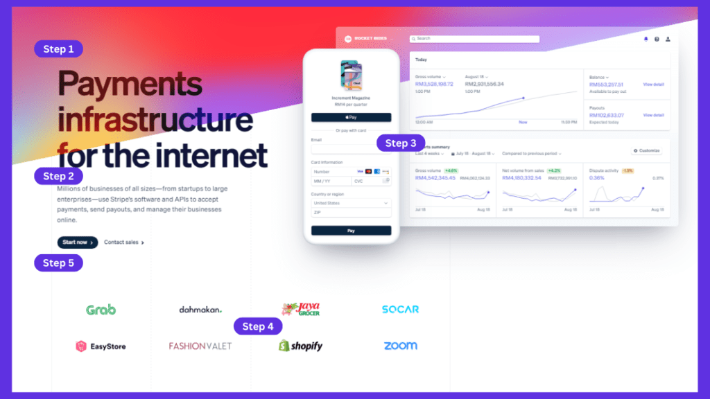
We like the headline – it tells you that Stripe isn’t just a payment gateway – there’s more to it.
But it’s still clear enough that anyone will understand that whatever ‘more’ is, it’s related to online payments and transactions.
Step 1: Explain the value provided ✅
If we look at the subheading, it becomes even clearer with the following excerpt:
“Use Stripe’s software and APIs to accept payments, send payouts, and manage their businesses online.”
Ok, so that’s how it’s a payment infrastructure.
Step 2: Explain how the value is delivered ✅
Stripe is flexing their app in action here with separate web and mobile screenshots.
The web view shows leads they can easily see an account dashboard overview on a legible interface.
The mobile screen shows leads that their customers will enjoy a modern, friendly and high-conversion checkout page.
A lot of Stripe’s customers are business owners, so both these views are impactful.
Step 3: Let the user visualize it ✅✅✅
Social proof is immediately clear.
It begins with the subheading where they say “Millions of businesses of all sizes from startups to large enterprises use Stripe”
This is then reinforced by that list of client logos – which by the way, they’ve customized by region.
Step 4: Make it believable ✅
And yep, CTA buttons are where they need to be.
Step 5: Make taking the next step easy ✅
Successful B2C Landing Page Example: InDrive (formerly InDriver)
InDrive is an international ride-hailing service operating in 47 countries. With more than 175 million downloads, they are the second largest ridesharing and taxi app worldwide.
A name change from InDriver to InDrive in 2022 came with a new page.
But by now they’re already big – we want to look at the original page that made them big.
Here’s what it looks like:
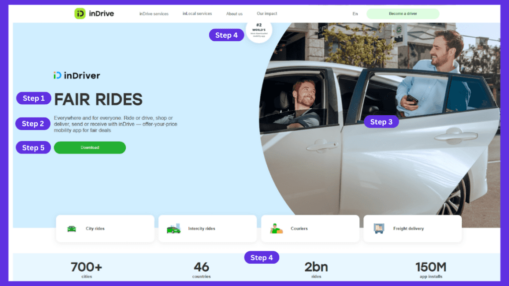
These guys are competing against Grab and Uber, and that headline-subheading combo clearly explains their value and how it’s delivered.
Headline sets up the value offering with ‘fair rides’, and the subheading delivers the punchline about users offering a price instead of being told a price (like with Grab).
Well, it doesn’t say it – but everybody’s thinking it.
Step 1 and 2: Explain the value provided & how it’s delivered ✅✅
We have to be honest, we’re not really feeling the visual.
Nothing wrong with it, but it just looks like any other e-hailing app.
InDrive has a strong USP in that users can offer a fare, so show it.
We found this screenshot on their play store page:
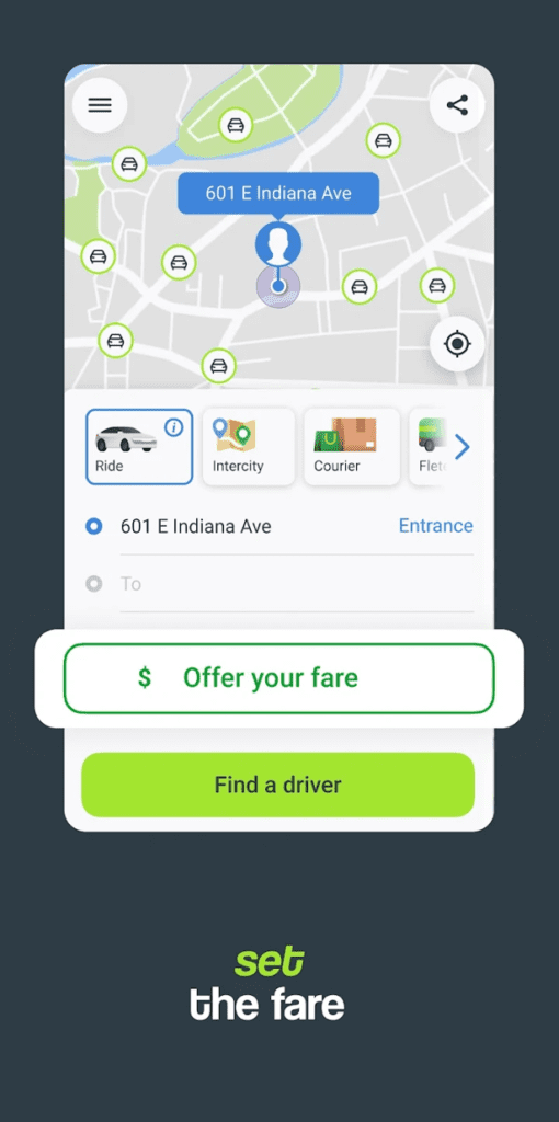
We’d keep this photo, put a mobile screenshot on top of it showing the offer in action.
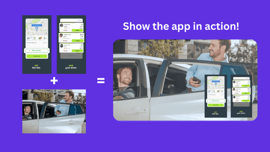
Just our humble opinion, but man it looks so much more compelling when showing the screenshots.
As it is, it feels incomplete.
Remember Harry’s advice show the app in action whenever possible.
Step 3: Let the user visualize it ❌
Sorry, InDrive!
On the plus side, social proof all over the page here.
We see impressive app stats and a little flex about being #2 in the world.
Step 4: Make it believable ✅✅✅
And yes, the CTA button is clear as day.
Step 5: Make taking the next step easy ✅
Below The Fold
We wish these were called something else – whenever we see ‘fold’ we just think of laundry.
Anyways, if a lead is interested but still unconvinced, and they scroll down, this is what the rest of the landing page should deliver.
1. Make the value concrete
If leads scroll down, they’re intrigued, but they’re also wondering
“Could this be bullshit?”
This is where you explain features in a way that removes any doubt the app can deliver as promised.
2. Inspire action
This needs a different kind of social proof from the one above the fold.
You want social proof that makes leads go ‘damn, I want what that guy’s having’.
3. Tie up loose ends
If there’s anything else you haven’t answered, time to address it in the form of an FAQ.
4. Repeat your call to action
Harry makes a good point here – at the bottom, we have more space, so the CTA benefit from a message that reminds the lead of what they get when they click that button.
Let’s recap:
- Make the value concrete by discussing features and objections
- Inspire action through specific social proof
- Tie up loose ends with an FAQ
- Repeat your call to action with a 2nd, more detailed CTA
We think the FAQ section isn’t compulsory – it’s to tie up loose ends, so include it IF you have loose ends.
Let’s look at some Below the Fold examples:
Successful B2C Landing Page Example: BODi by Beachbody
BODi is a workout and diet app that lets you create custom workout plans and meal plans tailored to your goals and lifestyle.
They have 1 million downloads on Google Play and in 2022, their parent company reported digital subscription sales of $2 million.
We head to their page and we get this:
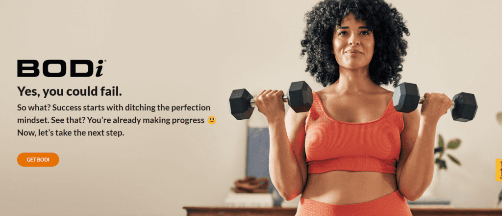
The text is not as direct as the earlier examples, but the positive messaging and that picture of just a normal looking person does wonders – you know it’s a workout product.
Now we scroll down.
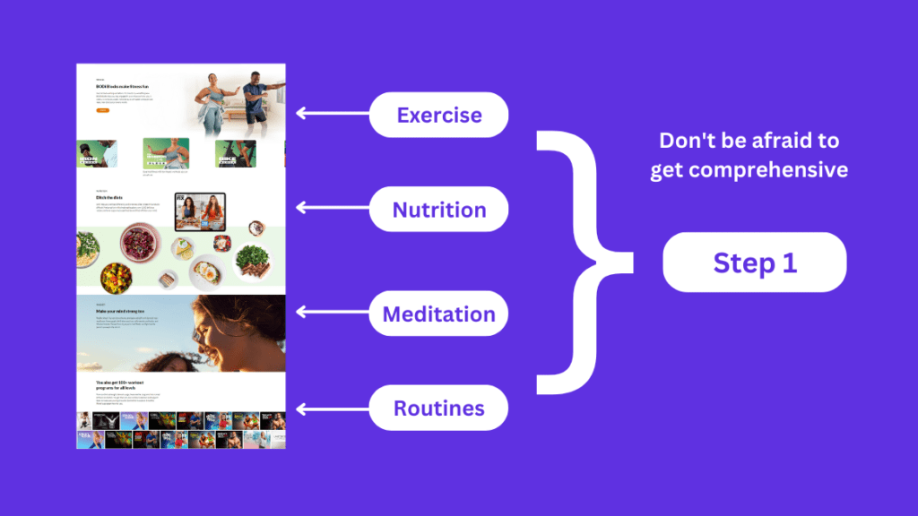
Here they’re making the value concrete by showing the different features the app has.
It transforms from being about fitness to health, but still feels like it delivers on the offer at the top.
Step 1: Make the value concrete ✅
Here we see social proof that inspires action.
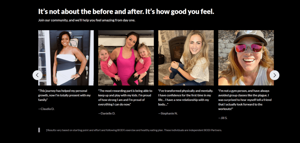
The users in their testimonials and the models in their visuals are connected. Just everyday people who want to get healthy and feel healthy.
If we read the testimonials, there’s no mention of “I got a six pack”.
Instead, all talk is about how users can now play with their kids, be with their family, and regained confidence.
Bodi knows that birds of a feather flock together.
Step 2: Inspire action ✅✅✅
And last, we see a second, more detailed CTA with some added social proof.
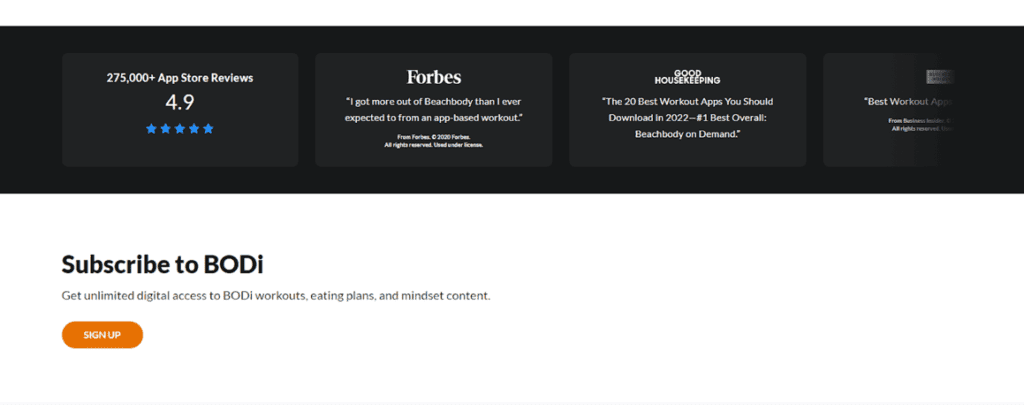
Step 4: Repeat your CTA ✅
No FAQ but it doesn’t seem to be needed here, and neither is it in our last example.
Successful B2B Landing Page Example: GrooveHQ
GrooveHQ is a helpdesk platform that was founded as a simple, no-frills alternative to bigger options like Zendesk.
Also, their founder is a non tech – check out our piece on lessons from Alex Turnbull and Groove HQ.
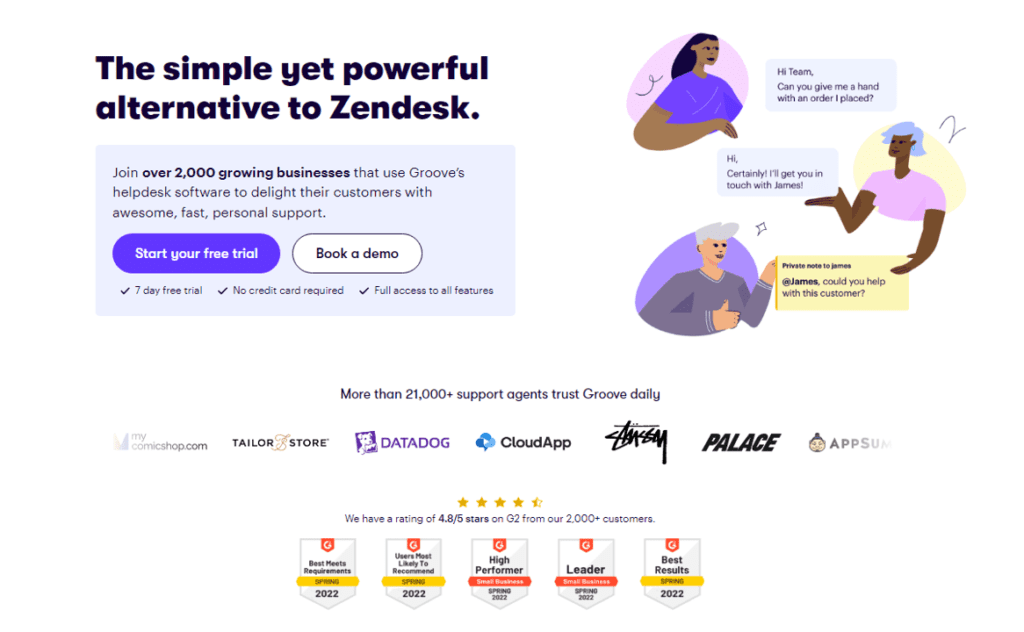
Go to their page and we get a perfect Above the Fold experience:
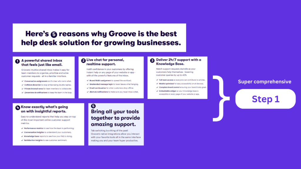
Their Below the Fold experience is pretty damn good too, so let’s scroll down.
We see their features that make their offer concrete.
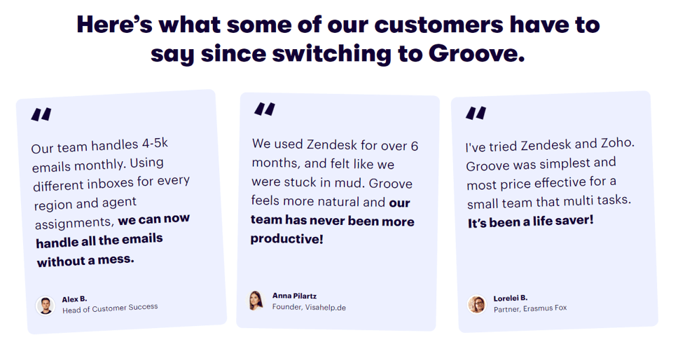
Followed by social proof from other business owners.
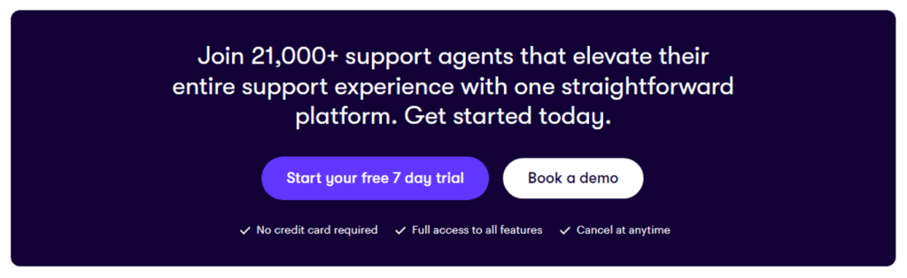
And finally, a hell of a second CTA.
Your turn to build a high-conversion app landing page
Of course, you need to know what ‘efficient conversion’ means.
According to WordStream, the average landing page conversion rate is 2.35% across industries, and the top 25% hit 5.31% or higher.
That obviously includes a huge range of pages, so do some research on conversion rates for your niche.
With the theory by Harry and examples from us, you’re ready to get your hands dirty – figuratively speaking.
Time to put together your own landing pages that can convert efficiently.
We recommend a simple no-code website builder that comes with ample templates.
There are tons of them out there so you can’t really go wrong.
With this piece of the puzzle out of the way, you can go back to your true love: developing apps that kick ass.
🔑 Key Takeaways
- Regardless of type of SaaS product or app, a landing page is formulaic and repeatable.
- Our landing page theory comes courtesy of a lovely site called Marketing Examples which in turn is run by a super sharp marketer called Harry Dry.
- Two major parts to a landing page are Above the Fold (immediately visible) and Below the Fold (leads need to scroll down to see).
- The Above the Fold section involves five steps: Explaining the value provided, how it’s delivered, letting the user visualize it, making it believable, and making it easy to take the next step.
- The Below the Fold section involves four steps: Making the value concrete, inspiring action, tying up loose ends, and repeating a call to action.
- Our favorite overall example is hands down GrooveHQ so do check it out for inspiration.