A Minimum Lovable Product or MLP is a concept that applies to early-stage app development – but there’s nothing against getting ideas from changes that came later in an app’s life.
Over the years, there have been many examples of small changes to apps that made a BIG difference in user experience.
In this post, we’ll look at five examples of Minimum Lovable Products and explore how they had such a radical impact.
After that, we’ll relate them to an app design theory near and dear to us as mobile app developers: the Minimum Lovable Product.
Across these diverse features, you’ll find three things hold true:
- they are relatively low-cost and uncomplicated features
- they had a disproportionately large positive impact on user experience
- they didn’t turn a bad app into a decent app – they turned a good app into a great app
Enough nerd-speak for now, let’s get to the first example!
Tinder’s Swipe Feature
This example is legendary.
Swiping on user profiles is without a doubt Tinder’s most app-defining feature, and it wasn’t even available until a year after the app was released to the market.
Before that, users could still accept or reject potential matches, but it was done with conventional buttons that users would tap.

Tinder exploded in popularity and every dating app since has included the swipe feature.
Why it worked: It introduced physical user gestures that emulate real-life movements for a more immersive and intuitive experience.
Facebook’s Like Button
How Facebook describes liking: ‘An easy way to let people know that you enjoy something without leaving a comment’.
What they really mean: ‘Now we own the heart and soul of every human on Earth with an Internet connection’.
For context, Facebook was founded in 2004, and only one year later already had six million users, all of whom were using Facebook to stay connected with people online. You could already leave comments on peoples’ posts, but in 2009, Facebook introduced the ability to do that in a split second with a really simple ‘like’.

There are two sides to this: giving and receiving likes.
Where giving likes is concerned, it takes something that users already want, and makes it effortless.
The difference between very little effort and zero effort is huge.
It’s the difference between no action and action.
Instead of people just scrolling past, they now stop to give a like – multiple times!
That is an insane change in user behaviour.
On the receiving end of likes, the impact has been so strong that multiple sources have linked the ‘like’ feature to social media addiction – people just can’t get enough of it. We’ve all felt that ego boost when reaching a certain number of likes.
Even the actual creator of the Like button, Leah Pearlman, has publicly asked users to stop obsessing over likes.
Listen, we’re not saying addiction is a good thing – but we’re looking at this from the perspective of an app developer. In that sense, we cannot deny that here is a simple feature that caused a huge amount of user interaction.
Every social app now has its own version of the like button, even Microsoft Outlook!
Why it worked: It provides users with a way to fulfil their desires effortlessly – or to put it bluntly – it gave users what they wanted without having to actually do any work!
The Infinite Scroll
Before the infinite scroll: users would reach the bottom of a page and have to decide if they wanted to consume more content (or just close the app).
After the infinite scroll: apps decided for users, and what they decided to do was dig their claws in and never let go.
With infinite scrolling, there is no more ‘bottom of the page’; more content gets loaded and users stick around to finish it, only for the same process to repeat itself over and over.
Aza Raskin, the man who invented the infinite scroll, said he wanted to eliminate the need for users to make another choice.
The idea took off and now infinite scroll is everywhere – social media platforms, blogs, video streaming services and of course, online marketplaces. The results of this simple change are clear – lower bounce rates for pages that used them.
We read an interesting article on why infinite scrolling is so effective: something called ‘unit bias‘.
It’s a compelling theory and the link above takes you to the full piece, but here’s a summary of it:
Humans like to finish things, and we feel really unsatisfied if we don’t. By auto-loading more content, users feel like they haven’t finished the page, even though the app has made that practically impossible by design.
The article linked to a 2005 study where a professor from Cornell University found he could get people to eat 73% more soup by giving them a bottomless bowl that refilled the moment it got low.
We think this shows that infinite scrolling (like basically every entry here) simply takes advantage of innate human nature.
Why it worked: It never lets users feel like they’ve reached the end of an action – just as they’re about to finish something, they automatically get a ‘free refill’ which they are compelled to finish.
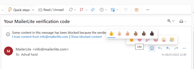
The ‘Unsend Message’ Feature
This one is really near and dear to our hearts because it’s saved us a few times.
By default, Gmail gives you five seconds to unsend an email,
Thing is, it’s all too common to realize something shouldn’t have been sent – after six seconds.

It’s always like that, isn’t it?
You’ve just sent out an email that was all good until you notice something that…ah well, might as well hand in a resignation letter.
BUT!
Did you know you can extend the unsend email feature on Gmail by up to 30 seconds?
Head to your Gmail settings – there’s a dropdown menu right there.

Having 30 seconds to look at our outgoing email has prevented truly dumb mistakes over the years, and everyone we’ve shared this feature with has said the same thing:
“Damn, if only I’d known sooner.”
We just know that behind that ‘damn’ is a sad, sad story.
Why it worked: It acts as a failsafe that gives users a decent amount of time to undo important decisions. Things like purchases or transfers or anything to do with official documents – if you can save users from embarrassment or worse, they will love you for it.
Google’s Front Page
This last example is something that can easily fly under the radar because most examples of improving an app involve introducing something.
Google’s search interface is the opposite: it’s the best example of adding lovability by taking away.
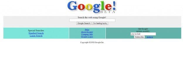
Let’s look at Google’s first-ever interface from 1997:
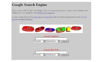
Taken in context, the UI is pretty decent for that era, but frankly, it looks like everything else.
The most notable feature is the ‘Search Stanford’ bar above ‘Search the Web’ – this is because Google’s founders are from Stanford and the search engine was also being used to index their university library.
Just one year later in 1998, the web search option was moved to the top and Stanford to the bottom. We also see the ‘I’m feeling lucky’ feature has been introduced.
Why?
Well, for one thing, it looks more aesthetic, but by having just one active search bar, the page could run faster, precisely what Google wanted to deliver.
Fast forward to today, and we have the interface everybody knows and loves.
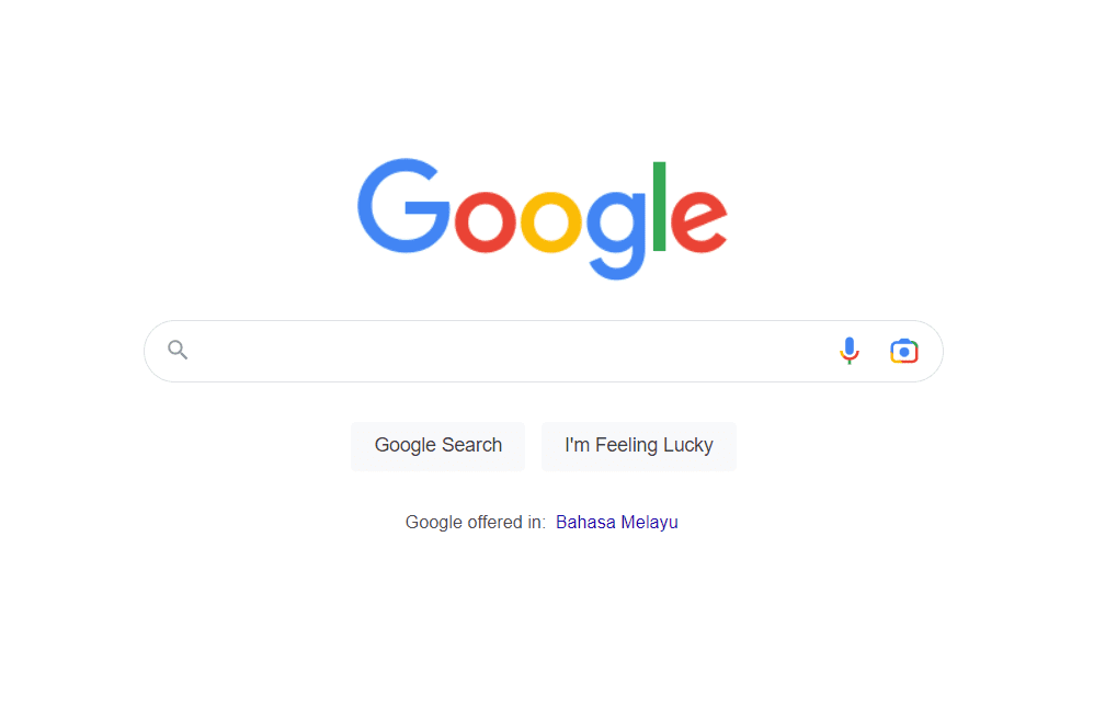
Looks-wise, it’s simpler and cleaner than ever.
We don’t think we need to cite numbers to convince anyone that Google is pretty popular.
It’s more used than ever and there’s a huge gap between Google and its nearest competitor.
And this was accomplished, in part, by removing unnecessary features.
By taking out the other special searches and focusing on just one, Google delivers a very straightforward package that they can optimize on the backend (which has no doubt gotten a lot more complicated since 1997).
In terms of what users actually see and interact with – this is about as minimalist as it gets, and that’s why people love it.
Meanwhile, who the heck uses Yahoo! anymore?
In fact, when was the last time you even heard of it?
But did you know that in 2000, during the early days, Yahoo! was the top search engine?
This famous graph tells an important story:
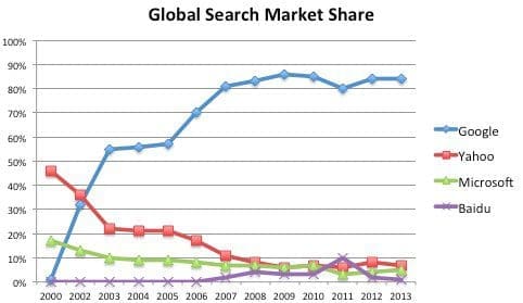
As Google’s search page got simpler and faster and Yahoo! stayed just as busy, Google began to gain ground, and then overtook Yahoo! in 2007.
Since then, it hasn’t even been close.
Why it worked: Secondary, less popular features were removed, leaving a single, primary feature to shine.
Alright, back to nerd-talk and good old app design theory: the Minimum Lovable Product.
The Minimum Lovable Product Theory
To conclude, here are the examples of Minimum Lovable Products or MLP mentioned above:
- Tinder’s Swipe Feature
- Facebook’s Like Button
- The Infinite Scroll
- The “Unsend Message” Feature
- Google’s Front Page
MLP is normally thought of as an early stage in product development, and to be fair, it is.
Take MVP or Minimum Viable Product, the most basic version of an app that can be shown to real users to get viability feedback.
An MVP must work, and an MLP takes it a step further.
A Minimum Lovable Product demands that not only does this early-stage product work but triggers a positive emotional response from those users.
That’s what the ‘L’ in MLP means – it must be ‘lovable’.
But at the same time, the ‘M’ stands for minimum – what’s the most time and cost-effective way to get from ‘viable’ to ‘lovable’?
That’s a really long-winded way of saying ‘minimum effort, maximum impact’, which brings us back to the five examples above.
These features may not have been implemented in early development, but they definitely scream ‘minimum effort, maximum impact’.
Relative to the overall budget, they don’t cost that much – they’re simple features requiring minimal resources.
Despite that, they had a huge impact on user experience – the apps were all already successful, but with these additions, they dominated by becoming more lovable.
How Upstack Studio Uses Minimum Lovable Product Theory
With founders who already have an app, our lesson here is to never get complacent.
Once we have a successful product, it’s easy to think ‘if it’s not broken don’t fix it’.
Facebook could have done that – they already had six million users.
Instead, they went and implemented a tiny little thumbs-up that changed the world.
So, if you already have an app, think of something small that can make your app a lot more intuitive, more effortless, more seamless, or more protective of its users.
If you’re still in the early stages of design, even better.
Can you think of some simple addition that every other app developer will be scrambling to copy and reinvent for the next fifty years?
That simple addition that adds massive lovability to your app is what will give you an edge over the competition, and it’s among the reasons why apps like Tinder, Facebook, Google and more have been so dominant.
Sit down with your mobile app developer and brainstorm some ideas!
Psst: Like what you just read? Then read some more! Sign up for our newsletter and get concise, actionable content on mobile app development sent directly to your inbox. Plus, here’s a snazzy little list of questions to interview app developers and find the right one for you.
App Developer Interview Questions Template
Download this template now so you know exactly what to ask App Development Agencies! Let us know where should we send it through the form below.